Thursday, August 4, 2011

LARGE AND LONG :: small and tiny


Large and Long is to Small and Tiny” is an explorative project about nature and our environment.  Its dimensions span 12’ H x 12” W x 10” D.  It is made up of CVP pipes for the internal structure and black satin ribbon for the exterior.  For this project I was trying to show 2 different elements of nature that I explored throughout the quarter. 


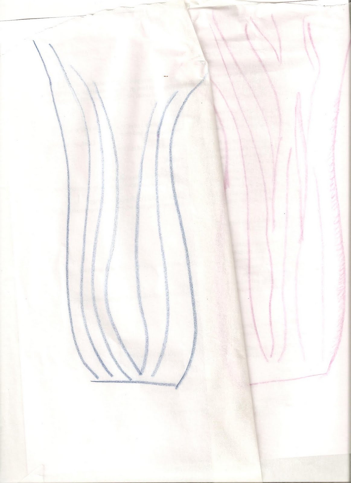
The first concept was the asymmetrical forms that are created by nature versus the symmetrical forms created by mankind.  I found that asymmetry in nature required a process to be created and evolved out of organic events.  (More detailed descriptions of these thoughts are located on my “Step 1 Final Project Blog)  For this Final Project I really wanted to highlight this organic nature of asymmetry by using the internal structure of my form.


The second idea I wanted to convey during this project was more of a conceptual approach referring to the “micro creating the macro” (More detailed descriptions of these thoughts are also located on my “Step 1 Final Project Blog”). 


While observing nature I realized that the micro is responsible for creating the macro which creates the forms we call nature.  This dichotomy is represented in the title and the use of individual ribbons to form the macro of the triangular surface.


This project was a huge undertaking and challenge for me.  I have never worked in such a large scale and have little knowledge of how to actually construct form using tools….I tend to be more of a scissor/construction paper kinda gal. 


The process of this project required me to test my mental boundaries as well as my faith in my ability to construct something of my mind that was difficult to explain to others.  I am proud of myself for my presentence and perseverance.  I was glad that the end result combined the two concepts I was trying to convey.  The project definitely made me more interested in working with large scale again sometime.

Stage 2 of Final Project Process


This was my internal structure of the form I created.  I used CVP pipe, hanging wire, 45 degree elbow braces, nuts, and bolts to create the design.  I made two asymmetrical triangles and connected them at the bottom of the form.  The top was separated by an 11 inch rod of screw threads to add a 3D element to the form. 

I used 5 pipes each at 12' long.  The two shorter sides where cut at 5' and 6' while the longest side was left at its original 12' length.  The corner was secured together with a 45 degree elbow brace, PCP pipe glue, and hanging wire to help maintain the tension.

For each connection point, I drilled holes (32 holes in total) in the CVP pipes and used screws with 2 nuts on each side of the pipe to stabilize the form.  I tightened the screws to create the bowed effect.  I would have liked for the bow to be more exaggerated but the tension was too great that the more I bowed the pipe the more it tried to bow back out creating an "S" form instead of an arch.

I spent a lot of time taking the form apart and putting the form back together to create an asymmetrical design that felt organic and unusual.  I was surprised to see how the form could change so drastically depending on the angle degrees, its orientation as vertical or horizontal, as well as if the form was hanging on lying on the ground.


These three photos show how I incorporated my conceptual idea into this abstract form.  As I mentioned in the previous blog, I was really inspired by the micro creating the macro and I knew I wanted to cover the form using this idea.

I used 90 yards of black Satin ribbon to French braid around the poles to create the micro detailing.  Gravity, slippery ribbon, time, and the arch all become problems hindering my craftsmanship.  It turns out that a braid does not work well when constantly required to shrink and expand in width to cover the arch/ triangle form. I also wanted to highlight the 3D design element of the separate triangles that came together at the bottom requiring a six-braid as I approached the poles tied together.  In order to make the craftsmanship as smooth as possible, I tried multiple techniques to stabilize the ribbon from falling.  I tired sewing each ribbon individually, lightly gluing the ribbon to the pole, using scotch tape as a fastener, as well as increasing the tension of the braid.  None of these techniques sufficed because when you adjust one stand, the whole braid is affected creating tension and problems in another area.  The whole braiding process took a total of 30 hours over the course of 3 days in an effort to finish the project in a timely manner. 

With all of the frustrations that were caused, I wish I could say that I am happy with the result but the flaws of the braid are really evident to my perfectionist eye; however, I am proud of myself for sticking with the process despite the heartache is caused.  With more time, 3 pairs of hands, and the fact that I learned from my hardships, I think I could have accomplished the final result I was striving for.

I do believe that the braid emphasized the conceptual approach I was trying to show in this piece.  From a distance the black satin looks like black paneling (a macro image) but the detailing up close is very different from a solid panel of fabric (the micro element) highlighting the symbiotic relationship of the two ideas.


Stage 1 of Final Project


This was my original photo that became my inspiration for my final project.  I was really drawn to the asymmetric design of this weed.  I was also inspired by the little twigs that make up this weed. 

In my mind this weed was the epitome of nature.  It represented the micro creating the macro within an environment.  The whole weed bush was taking over the lawn so each weed then became the micro creating the macro of the bush.  Throughout the quarter I decided that the layers of micro creating macro creating more micro creating larger macro was really interesting to me and this was the conceptual approach I for this project.


This was my sketch of my project idea on tracing paper.  I placed the tracing paper on-top of my photo and used an exaggerated asymmetrical design to abstract the form of the weed.  My original plan was to create this arch that a person could stand under as drawn in the top right hand side of the picture.  Although ambitious, and a far-cry from the final project, I knew above all I wanted to create an asymmetrical design. 

 Asymmetry is something found throughout nature and not necessarily found in man-made objects.  Asymmetrical designs feel very organic to me when created in a subtle, almost unintentional manner.  It requires an evolutionary process to create a flow that is pleasing to the eye.  An inherent concern with asymmetrical designs is that they will appear unbalanced and create an uneasy feeling for the viewer.  This was a pitfall I was conscious not to fall into.


Sunday, July 17, 2011

Tracing Paper Sketches


These tracing paper sketches show other possible ideas for my final project as we explored the process of abstracting form.  The inspiration photo is placed under the sketch to show how my forms began to take on abstract shapes.

As part of an in-class exercise, we placed tracing paper on top of our photos tracing the form created by nature through our photos.  We then took the form and abstracted it to create a nonrepresentational rendering of the object in nature.

I found this process rather therapeutic and something that sounded insane but that actually made a lot of sense.  It is a great strategy to use as inspiration for future art projects.

Friday, July 8, 2011

2 Form Sketches


6 Micro Images


2 Negative Forms


Suburbia


As I have been examining landscapes and nature throughout the quarter I have noticed that nature rarely produces straight lines and manmade nature always incorporates straight lines.  The goal of this project was to show the manicured versus the wild.  We create natural environments by mowing the lawn, adding pavements to walk on, and introducing none native flowers.  All of the efforts are quite the opposite than what nature actually is.  We have become a weed to nature destroying the environment in order to put up what we perceive as a natural environment. 
I placed the dandelions on the edge of suburbia where the lawn service only mows about 2 feet from the side walk then the landscape turns into a forest of woods and weeds, a far-cry from the manicured suburbia landscape.


Sunday, July 3, 2011

Colors of Nature


The piece was my favorite piece to work on because we use fine to tie all the branches together.  You can’t really tell from the photos but it was branches placed together to make an arch into the forest from the gravel sidewalk.  It was about 4 feet off of the ground and detailed with all sorts of foliage from the forest.  It was the gateway to nature for the urban development of the park.  I wish the pictures would have turned out better.

Gateway

The gateway was about 4 feet off of the ground creating a gateway to nature.


This picture is taken from the back of the piece to show our use of vines to tie the branches together.


The piece was my favorite piece to work on because we use fine to tie all the branches together.  You can’t really tell from the photos but it was branches placed together to make an arch into the forest from the gravel sidewalk.  It was about 4 feet off of the ground and detailed with all sorts of foliage from the forest.  It was the gateway to nature for the urban development of the park.  I wish the pictures would have turned out better.

Together


Me


Terri

Anna

This piece was my favorite of the collaborative projects.  We all really enjoyed working on it and really bonded with the environment and each other.  The piece was commenting on the use of the beach as a place people go to socialize with other people. 

The piece was in a very visible spot so people walking by were interested in what we were doing which made the experience even more worth while

Thursday, June 30, 2011

Weighted Memories

 Weighted Memories
 The Address label of my current location and the location where I am about to move.  If you were to open the box the label would be cut in half signifying the separation from Steilacoom to Arizona.
The empty Arizona side of the box.  If you were to look through the key hole you would see a dark abyss of emptiness representative of my lack of memories associated with Arizona.

The Steilacoom side of things.  The Steilacoom side is filled with roughly 25 pounds of plaster signifying the weight of emotions I have associated with Steilacoom.  Since I am moving the side has a lock on it to show how this side of memories is now locked in my mind which can only recall  alimited representation of my life the past tow years.

This picture was taken to show how the two sides work with the image of the box.  The "top" of the picture is the Arizona side.  The "bottom" is the Steilacoom Side.

Weighted Memories- Artist Statement


During the artistic process of this assignment, I began to realize that a place moves from topos to chora because of the weight a person gives that place.  That "weight" is the memory or emotion behind a place that makes it memorable in either a good way or a bad way.

As mentioned in one of my other posts, Steilacoom has played a significant role in my life the past two years.  Since I am about to move to Arizona I have been reminiscent of all the wonderful memories I have made here.  This internal dialogue is what I wanted to explore in this project.

I chose to use a APO flat-rate box as the basis of my project because of my husband leaving me in Steilacoom while he was deployed to Iraq for a little over a year.  I got to know the postwoman of Steilacoom a fare amount due to how many packages I sent.  On the address label there is my address of Steilacoom listed as well as my new address in Arizona.  If you were to open the box, the addresses would be separated much like I am being separated from Steilacoom to go to Arizona.

On one side of the box there is Steilacoom depicted in tissue paper and Arizona is on the other side.  I chose decoupage of tissue paper because you have to physically rip the material to create color, texture, and form.  I unwilling have to move to Arizona so I am  consider myself to be ripped from this place I have grown to love.

On the Steilacoom side I place a lock and on the Arizona a door knob.  The lock is a literal interpretation of the memories that will be locked in my mind of Steilacoom.  With the move I can no longer add any memories either--so the city is locked to me.  The door knob on the Arizona side is for the door that is opening in Arizona which may be filled with good memories or possible bad-- Either way it will be filled.

If you were to lift the box you would fill how uneven in weight the box is.  On the Steilacoom side there is roughly 25 pounds of plaster signifying the "weight" I have given to Steilacoom.  If you were to look through the key hole on the Arizona side you would see that side of the box empty, filled with nothing.  I have yet to make memories there and have no idea what to expect so the emptiness conveys the uncertainty and the potential for loneliness.

I am really happy with how the project turned out.  It has been very therapeutic for me to examine my subconcious of the emotions and fear it has for the huge change in my life.

Wednesday, June 29, 2011

The sunset of my mind


For my wet medium I chose to draw a sunset of my mind.  This sunset is perhaps beautiful but I wonder if I would actually like to be there to see this sunset.  To me it seems hot and intrusive.  There is no boundary to the land which is lonely and expansive. I chose to cut my paper into a circle symbolizing the limitless boundaries of not only the land but the sun as well.

 I really enjoyed using oil pastels for this piece.  I liked pushing the blending of the medium and found the long horizontal strokes relaxing to execute.

Man-made Beauty

I am sorry the image is vertical. ON my computer it uploaded the correct direction but when I was trying to upload the image to the site it would not upload the image horizontally.

For the dry medium landscape assignment I had planned on using this drawing.  As I was walking around Sunnyside Beach in Steilacoom I noticed that what made up the "ambient array" of the landscape picture were all things man made.  There is the Tacoma Narrows Bridge to the right, the Ferry to the left, and railroad tracks directly behind you.  Even the beach itself is man made.  The more I thought about it, the sadder I found it to be because it seemed like the town of Steilacoom had created this landscape image.  
As I was walking along the beach, I noticed this piece of rusted iron.  It reminded me that there is nothing man made that is stronger than nature.  I thought the texture and color really captured the texture of the beach and the tone of the landscape.  
I chose not to produce this as my final work because it was hard to create form and fine lines with a sharpie marker.  I really like how the piece turned out, I just thought it did not fulfill the goal of the assignment.

Sunday, June 26, 2011

Being Torn from the town I love

The "map" below shows some of the important places in Steilacoom.  I use paper mache to create a "torn" look.